Topple The Paradigm


the simple life poster had nerve
they used all caps
some letters were bold
the thing was a mess
to topple the paradigm
use one font only
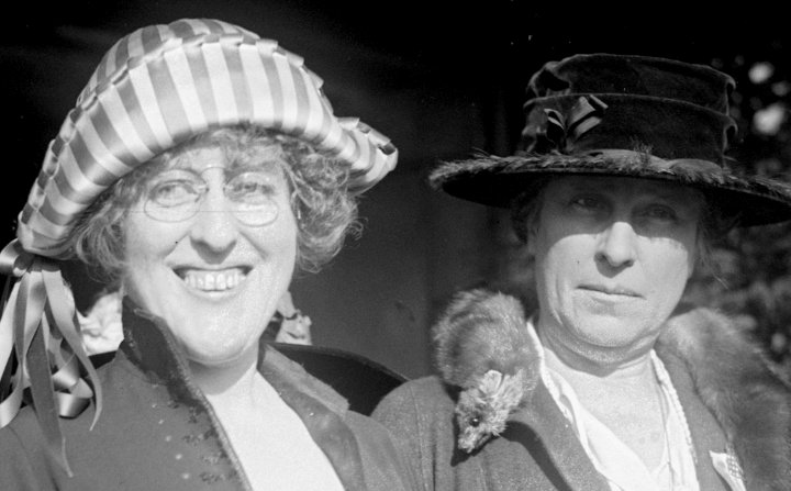
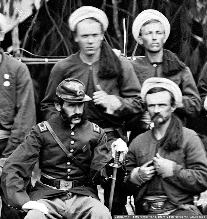
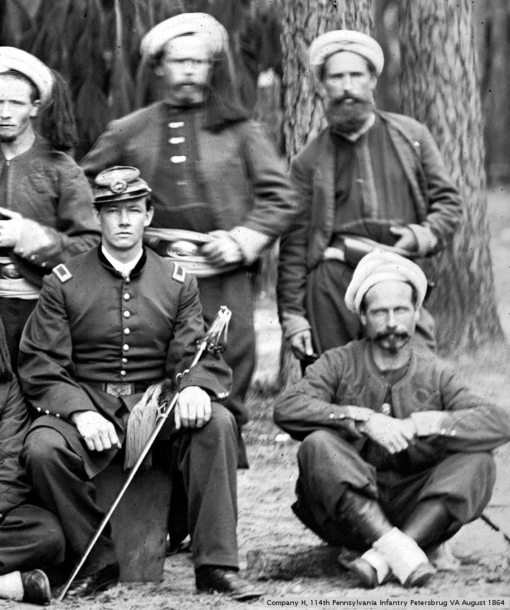
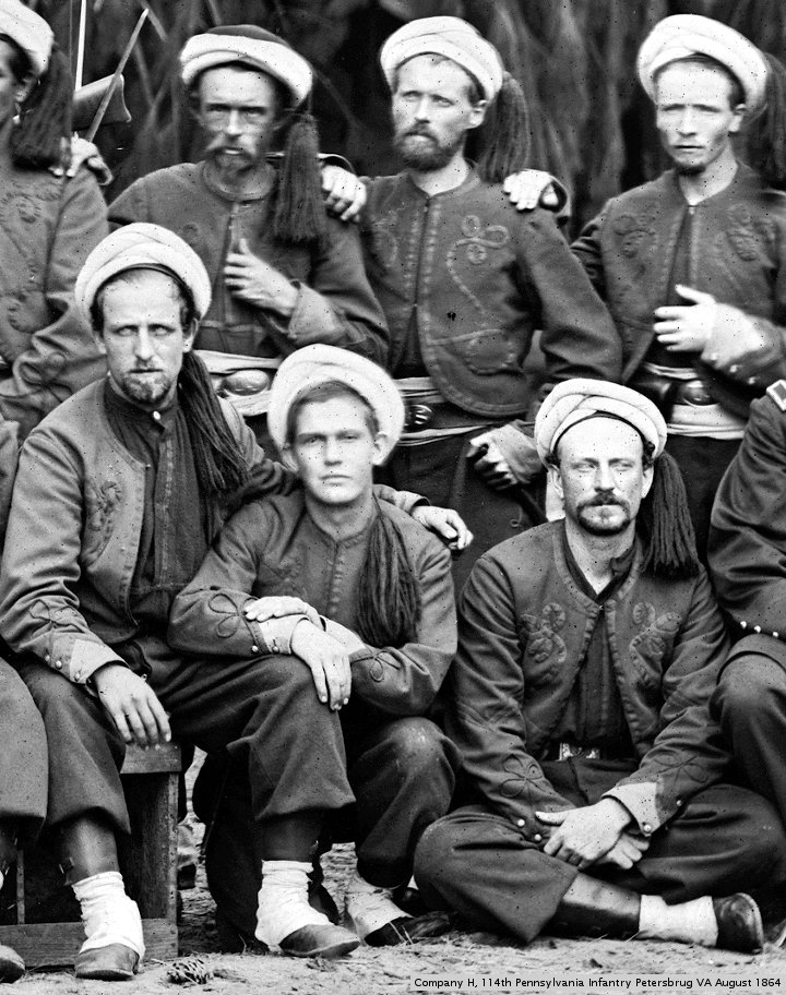
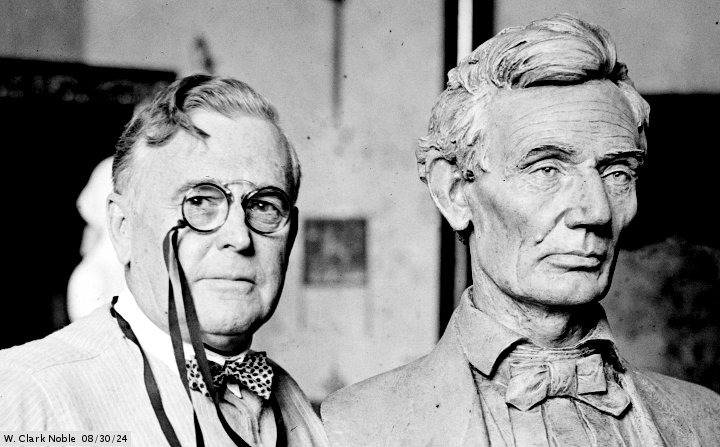
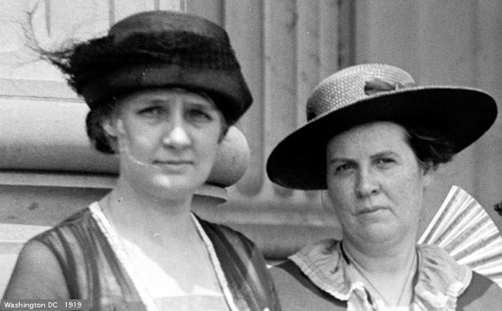
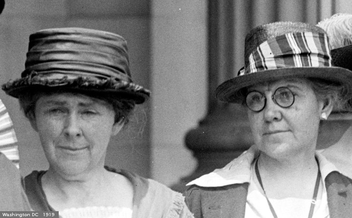
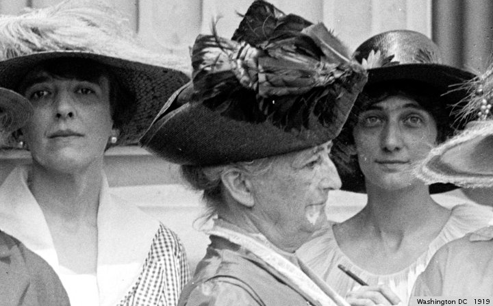
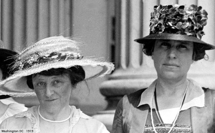
pictures from the library of congress.

the simple life poster had nerve
they used all caps
some letters were bold
the thing was a mess
to topple the paradigm
use one font only
pictures from the library of congress.
Subscribe to comments with RSS.
This site uses Akismet to reduce spam. Learn how your comment data is processed.

Interesting pictures as usual.
I like it!
I love these pictures and how you used topple.
Maybe I should have said twenty cents instead of pair of dime.
Ahhh. . .inspirational Facebook posts. The underbelly of the internet. :-) Thanks for linking up!
I think I read somewhere that you really shouldn’t use more than three fonts in one object, and that the fonts should work together…
I am not a graphics geek. I think one font is usually enough.
A concise piece about a subject close to my heart! Very nice.
Fascinating way of responding to the prompt. I agree with one or at most 2 (for titles) fonts in any one piece.
The top left hand lady looked just like my late Aunty Winnie.
Wow. Trifecta is new to me, and this time I didn’t read any other submissions before lopping my in… so I’m also fascinated by your response the prompt. It’s very interesting.
Great pictures words.
great pics